
Showing posts with label colors. Show all posts
Showing posts with label colors. Show all posts
Friday, April 29, 2011

Thursday, March 31, 2011

Monday, March 14, 2011

Sunday, February 27, 2011


Saturday, January 15, 2011
Burberry Prorsum Fall/Winter 2011-2012 Menswear
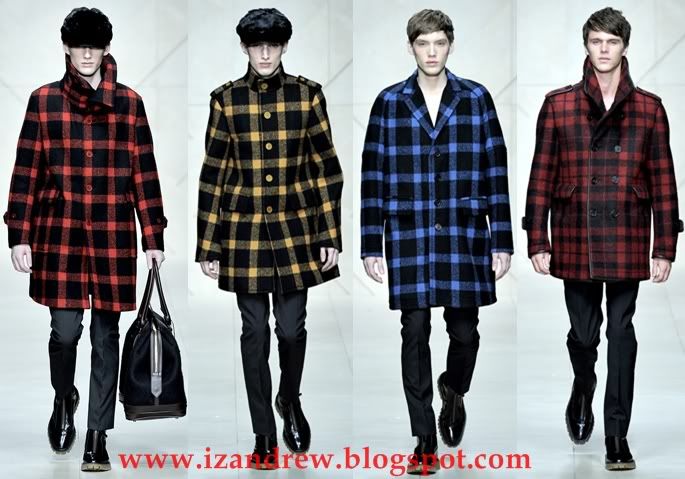
Approaching the fall/winter 2011-2012 season with endless color and exaggerated proportions, Burberry Chief Creative Officer Christopher Bailey looked to a coat for all seasons. Creating his very own weather boy, Bailey’s outerwear stole the show as usual. Embracing the unexpected, the 60′s provided the inspiration for slick raincoats, quilted finishes and a rainbow of checks. Gathering pleats and reworking tweed, Bailey once again delivered an easily cool showing for a timeless label.

Tim Blanks review
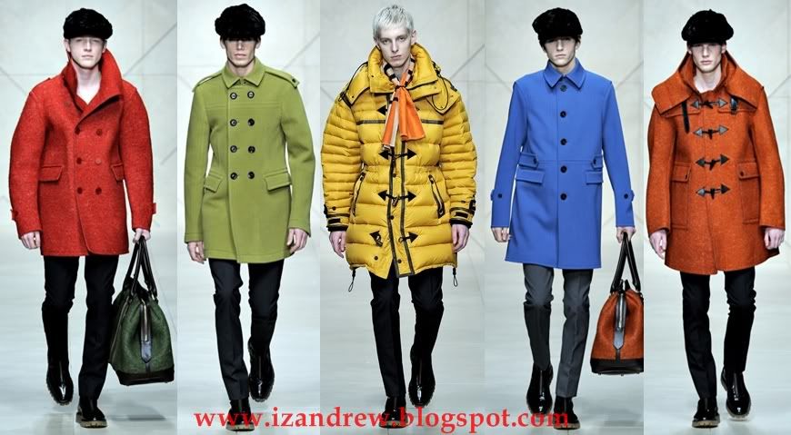
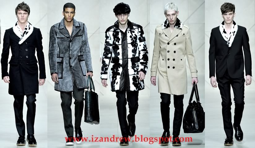
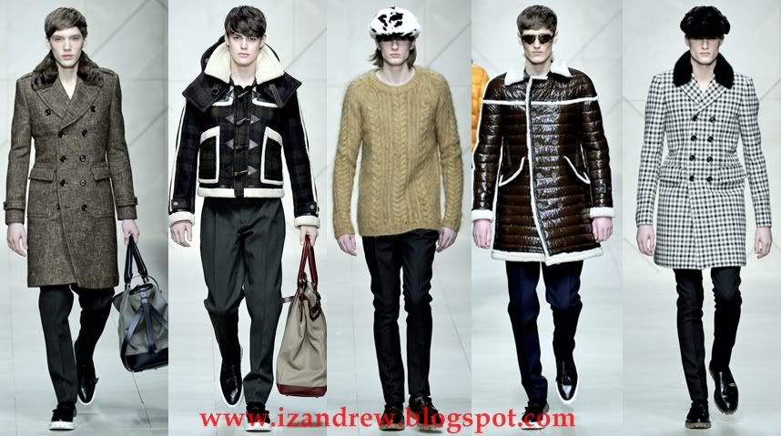
There is, in case you haven't noticed, a royal wedding about to go down in London, so it was tempting to extract regal references from Christopher Bailey's latest collection for the most heritage-based of all English fashion companies. The neat little coats were the sort of thing young princes might have sported in days gone by, and the ermine-look fur trim had obvious royal connotations, even it was in fact something called "jaguar mink." But the real backstory was both bigger—and smaller. Small first. In the bottomless Burberry archives that are such an inspiration to him, Bailey found an ad campaign from the early sixties where every single image was photographed in different weather conditions. And that—cue the big picture—instantly led him along to the current, utterly ga-ga global weather situation.
Bailey is nothing if not focused. He decided on a coat for all seasons as his theme for Fall 2011, and that's exactly what he offered. There were myriad accompanying permutations of skinny pants, suits, and knitwear that was lacquered or cable knit in combo with furry doeskin. But the Main Event was The Coat in weights that were variously suitable for rain or wind or snow. Here's testament to focus—just as with Bailey's aviator jacket collection last Fall, almost every single coat was an object of lust, from the buffalo-check biggie that opened the show to the "jaguar mink" coat that closed it. Bailey used color astutely—an orange duffel, a pea-green military coat—but he also nailed subdued city camels and tweeds (fur-collared for luxe). And he closed his show with a full-on catwalk rainstorm, courtesy of his special-effects team. The only other designer who dared corral the elements was Alexander McQueen. In his own, much more subtle way, Bailey is as daring.
The kicker for the whole event is that every coat is available on Burberry.com until January 23. "Personalizing technology" is Bailey's game plan. "It makes the whole world smaller, more intimate," he said after the show. Sure, it's a spur to sales, but it goes beyond that; Bailey's acknowledgement of the universality of what he's doing is as timely as the inescapability of the climactic conditions that inspired his latest work.
Source: Style.com


Jil Sander Fall/Winter 2011-2012 Menswear

A master of progression, Raf Simons takes the Jil Sander man on a journey from spring’s colorful bursts of color and narrow proportions to boxy shapes and darkness. Throwing in a subtle shift of texture and oversize pocket details, Simons’ knack for refined but simple tailoring gets a powerful kick of subdued quirk for a collection that is undeniably Jil Sander.


Tim Blanks review
Intriguingly, Simons designed without a single piece of clothing from the archive in his studio, which is probably why the most immediate cross-reference was his own Spring womenswear for Jil. For his women's show, he talked about "a mille-feuille of color." Here, it was subtly adapted, particularly in the doubled turtlenecks. Pink lined a parka hood, yellow shone from under a swirling charcoal coat. The experimental volumes of the women's clothes were toned down but still implied, for instance, in the caped back of a blouson. And the chunky parkas that cut such a dash last season made a welcome reappearance. So that was the Raf-ness of the show.
The Jil-ness came through in the plain, felted square-cut suits—three buttons, high closing. They were paired with similarly shaded tops and, even when colored broom yellow or cyclamen, they had a distinctly sober air. Simons elaborated on the sobriety by using the quilting of the Amish as the signature detail for jackets, pants, and tops. On the other hand, he injected an ironic note by duplicating the nobility of the handcrafted Amish tradition with the most advanced fabric technology. That's where Raf-ness and Jil-ness reunited—and it felt so good.
source: Style.com/
Subscribe to:
Posts (Atom)